Friday, June 12, 2009

The last huzzah!

My last tutorial for this term:( Oh tutorials,parting is such sweet sorrow...

  1. Design a Ready to Print Brochure in Photoshop


http://psd.tutsplus.com/tutorials/designing-tutorials/design-a-ready-to-print-brochure-in-photoshop/#more-3621

I decided to check out this tutiral because I was requiered to make a brochure in another class. This tutorial didn't skip any of the details required to make a decent brochure. From how to correctly layout and fold the paper,to the design itself, this tutorial has got every thing you need!

2.Creating concept art in photoshop

http://www.photoshoplady.com/photoshop-tutorial/create-spectacular-concept-art-in-
photoshop/

This tutorial takes stock photographs and mixes them with other images to create effect that is easy to reproduce. You can also make it work almost any combination of images. In this tutorial they combined a city scape image with a rural scene. The results was a glowing out of this world scene!


3.How to Create a Retro Boxing Poster in Photoshop

http://psd.tutsplus.com/tutorials/designing-tutorials/how-to-create-a-retro-boxing-poster-in-photoshop/

It just looked so cool I had to check it out!I love the retro look, and the example on this poster looked rad.The tutorial shows you how to reproduce classic design and give it an aged look.


4. How to Create a Grunge Style Illustration with Stains

http://psd.tutsplus.com/tutorials/designing-tutorials/how-to-create-a-grunge-style-illustration-with-stains/

Taking a photo of a person,portrait style, using photoshop it is given the effect that it was created entirely in ink. I really liked how the included the texture of a cloth canvas!

Sunday, May 24, 2009

Tutorials.

Before I began this weeks tutorials I just want to shot out a thanks to Nicole! If you haven't noticed I often take a peak at what tutorials she's doing this week, realize how awesome they are,and then do them too! Thanks Nicole for letting me steal your great tutorial ideas!

1.Nature Blur Effect
http://www.photoshopstar.com/effects/nature-blur-effect/

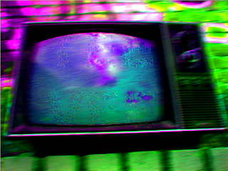
Once again I didn't choose the best picture to test out a tutorial with,but hey it was fun. I took the image of a T.V and attempted to write "TEE-VEE" on it. Didn't turn out very visible at first, so then afterwards I played with the saturation and contrast to try to get the text to show up a little better.


2. 10 Steps to Improving Your Photoshop Skills
http://psd.tutsplus.com/articles/techniques/10-steps-to-improving-your-photoshop-skills/

A nice review on how to step up your game on photoshop. Helpful tips on how to improve your skills.

3.Improving your photos on photoshop
http://www.flickr.com/photos/soffia/505766043/

Using images on their flickr account, this tutorials shares handy tips on how to make your photos look better in a variety of different ways by using photoshop.

4.
Visual effects in the style of 300
http://www.rickdavidson.com/2007/04/30/visual-effects-in-the-style-of-300/

I'm not usually a fan of action movies, but I gotta admit the movie 300 was awesome! This lovely tutorial shows you how to copy the cinematography stile used in the movie and apply to your photos.

5.
Movie effect for your photos
http://ebin.wordpress.com/2007/03/21/how-to-turn-your-photo-into-movie-like-effect-using-photoshop/

More movie effects! Yeah I know 300 was also a movie,but this effect is different. It gives your photos a grainy bluish feel that's pretty cool looking.

Friday, May 15, 2009

T-T-T-T-Tutorials!!!

1.Clone Stamp
http://www.youtube.com/watch?v=MWn0lxRNqos&feature=SeriesPlayList&p=D19BCF9D57320E03&index=2


Before After

This video tutorial was a review on how to use the clone stamp tool. It was simple and straight to the point,but also hilarious! I don't think I've ever heard the phrase "sprain your vagina" used in an Adobe software tutorial before.
I tried out the clone stamp tool with an image I took of a T.V. I covered up the section that had buttons with the lower part of the control panel.Magical!

2.Halftone Dots and Linear Light Tutorial
http://www.theshockzone.com/tutorials/halftonedots.php

Shows you how to (In a really short amount of time!) make a halftone composition. Simple and fun!

3.Circular Design Techniques
http://www.bittbox.com/illustrator/complex-circular-design-techniques/

Shows a simple trick to use with shapes in illustrator, all ya really need to hit is command D. Makes some pretty neat designs.

4.Combining Multiple images
http://www.tutvid.com/tutorials/photoshop/tutorials/compositeImage.php

Shows you how to combined 2 or more images in photoshop. There was a lot going on with this tutorial! A lot of steps needed to combine images together, but defiantly something you need to know.

5.Cloning images into smaller sizes
http://psd.tutsplus.com/tutorials/tools-tips/useful-applications-for-the-clone-stamp-tool/

Kinda similar to the other tutorial involving the clone stamp,but this one takes it a step further and shows you how to create a smaller image of the one you've copied.

Thursday, May 14, 2009

Tutorials


  1. Lights,Camera ,ACTIONS!
http://www.tutvid.com/tutorials/photoshop/tutorials/createGalleryStylewActions.php

This tutorial was about creating a frame for your photos. I was silly and choose a photo I had taken that had a mainly black background.Whoops!
But I did learn a lot. Not only do I know understand what an action is, but I made one!


2.Eye-shadow effect.
http://www.dphotojournal.com/photoshop-tutorial-apply-eye-make-up/

Okay so I don't often find the need to add eye shadow to my photographs, but I figured it'd be fun to check this tutorial out so I could at least play with color in photoshop a bit, or at least touch up some pictures of my cat by adding some stunning turquoise eye shadow.
The basic concept was to have different color layers over the photo to create the affect of eye shadow. It was neat,though I don't know how often I'll be using it.

3.Creating Digital Tape
http://www.tutvid.com/tutorials/photoshop/tutorials/tapedEdges.php

This tutorial showed me how to make digital tape and how to edit a cork board image and photos. It wasn't to complex, but it did help me learn more about how to add effects on the layers, so that was neat!

4.How to Use Depth of Field to Create Portraits with Blown-Out Backgrounds

http://psd.tutsplus.com/tutorials/photo-effects-tutorials/how-to-use-depth-of-field-to-create-portraits-with-blown-out-backgrounds/

This tutorial gave you tips on how to improve your portraits with tips for how to use your camera and photoshop.
It explained the gaussian blur function on the background to adjust the background to a fuzzier state.

5. Making Skin Beautiful
http://www.tutiki.org/w/index.php/Beautiful_Skin_by_Czechman

This focused on removing flaws in the skin that can be seen in photographs. In photoshop it shows you how to remove or soften major flaws in the skin,
touching up undesired reflections and highlights ,apply a Gaussian blur to the skin to soften and blend it, and spot sharpening . It explains how to properly use the clone and blur tool, in such a way that you cant tell that editing was done in the photo.

Final Buildings


Monday, May 11, 2009

Flat patterns

This is an outdoorsy one. I want the wood texture to only appear on the tree silhouettes,so I'm working on it.

This one is suppose to have some school spirit in it! I'm hoping to even out the texture on top of the wood planks.

Sunday, May 10, 2009

Building Blocks


Here's my sketches for the exterior art building ideas. I apologize, my amazing 3-in-one scanner was not in a good mood today so I had to use a camera to get the sketches out of my notebook.

My first concept is very simple. I wanted to incorporate some PSU school spirit since the building is PSU's. In a simple font I wanted to the PSU initials on the building in the schools colors.
Second idea was to incorporate the great outdoors in an urban setting since I've noticed Portland enjoys doing that a lot!
Third idea I wanted to have some sponsorship. So who's the king of beat you over the head advertising? McDonald's ofcourse! So McDonald's all over the building!