Thursday, April 30, 2009

More tutorials!!!!!!Say what?????!!!!!!!!!

So I was creep'n on some other people's blogs and saw that they had some awesome tutorials involving photo edits on photo shop,so I decided I'd give them a whirl.

http://www.tutvid.com/tutorials/photoshop/tutorials/coloringReColoring.php

  1. This one was awesome! I really liked the second way he showed how to do color editing. It was very easy to follow and very fun!


He also showed me how to turn a black and white photo into a color one. It was pretty cool so I did a quick test to see what I could do.

Monday, April 27, 2009

Tutorials,Yay!


  1. I figured since we were working on our Logo projects in class I would do the tutorial titled "How to make a Logo". This site is the same one that showed me how to use the mesh tool and I really liked the way they explained things,so hopefully i'll have similar sucess.
Like the mesh tool I did have some success with this tutorial. I've used a drop shadow in photoshop before,and now I know where it is in illustrator!
I didn't make the most impressive logo ever, but it was really fun being able to play with the text.
This tutorial did explain most things really well,though when the author choose the
<- "soopfresh" font I wasn't sure how he got there. http://www.jt-book.com/illustrator/


2. I wanted to work on my pen tool skills some more,so I decicded to try out the video that Kate sent us on it.
The video explained the pen tool very well. It was made for beginners(like me!) so it was nice that it was easy to follow. I didn't get a ton of new info, but there were a lot of great tips for short cuts.

http://www.youtube.com/watch?v=5DzpT8POAME

3. So I tried the create wood grain texture effect on illustrator tutorial. It was going alright until about half way through when I got kinda lost. It seems like a cool effect so I think i'll give it a try again on another day when I'm not as sleep deprived.

http://vectips.com/tutorials/create-a-wood-grain-texture/


Monday, April 20, 2009

Final Little Friends of Printmaking


These are the finals of my "Little Friends of Printmaking postcard series". It has defiantly changed from the original sketch,but I'm glad I made the changes.I'm especially glad I decided to change the color scheme. It is defiantly not on the same level of greatness as the actual Little Friends of Printmaking,so I consider this more of a tribute to them. Cheers!

Tutorials


1.slowly but surely I am beginning to understand the pen tool. I am hoping to make it my friend rather than my foe.
http://vector.tutsplus.com/tools-tips/illustrators-pen-tool-the-comprehensive-guide/

This had basic tips on how to use the pen tool,which is exactly what I needed!


2.This one was very helpful, especially to an illustrator beginner like me! It has 17 tips tips to save time and over all make illustrator easier. I will probably be referring back to this site many times in the near future!

http://www.bittbox.com/illustrator/17-tips-that-will-save-you-time-in-illustrator/

3.
Illustrator Tutorial 0003 -Amazing Hidden Tricks in Illustrator! (and other cool tricks)

I did this one just for fun,because tricks are neat,right?
The first trick showed you how to make shape have a
Spirograph effect. Spirograph! Yes you heard right,and one of my favorite past times!

http://www.design.iastate.edu/LABS/tutorials/illustrator/illtut0003.html

4. At the same site as the one above I read about random little tips that can hopefully make my life easier in illustrator!

What I learned from the site:
  • How to easily duplicate objects
  • Quick menu options
  • Guide hidden feature
5. For the last tutorial I tried to learn more about the mesh tool because I had never used it before.
So after that tutorial I am defiantly not the master f the mesh tool. But I do know know what it is and have a very rough idea on how to work it.Yay!

http://www.jt-book.com/illustrator/


Monday, April 13, 2009

The Little Friends of Print making, F.Y.I!


Who Dat?

The Milwaukee based pair of JW and Melissa Buchanan are the husband and wife team known as The Little Friends of Print Making. The duo began working at the University of Wisconsin in Madison, where both were studying art. Known for their mastery of screen printing, their brightly layered imagery, and their quirky sense of humor. They have created gig posters for many bands including......
  • Cat Power
  • Wolf Mother
  • Death Cab for Cutie
  • Silver Sun Pick Ups
  • Nada Surf
For more info Visit http://thelittlefriendsofprintmaking.com/ !

Sunday, April 12, 2009

Illustrator Review


Things I learned through the Adobe tool review:

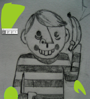
  • A short cut for the crop key & how I can use the crop key to choose diff rent settings for the image(video,print,web)
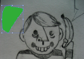
  • The Difference between the slice tool and the slice select tool
  • I understand the pen tool a little bit better now(But just a little bit!)
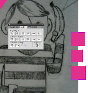
  • I have a much better understanding of the Alignment tool now, and see how you can select certain objects to be the main point of the alignment
Yeah,it doesn't look like much,but I do feel a little bit more comfortable in illustrator. Progress!

Review of the tutorials:
The written directions were so-so. The video's provided were awesome! Made it much easier to follow along on my own with illustrator.

Sketchy


The beginning of my postcard project based on The Little Friends of Print making.

Saturday, April 11, 2009

The Grand Finale'!


My Four Final Patterns

In general I like how my patterns came out. I'm glad that I worked on the first pattern(The one with the lower case i's).Now it's not too simple as it was before. I wish I had time to play around with color on some of them,might have made them more interesting.


Monday, April 6, 2009

Tutorials!!!


For the first 3 I used Veerle's Blog which had tutorials on using the pen tool in illustrator. I'm a visual learner so it was great that three different videos were there to show how you can keep adding to your drawing with the pen tool.

Even though the videos provided were awesome, I think a lack of sleep affected me being able to grasp the full concept of the pen tool.But you know what they say "Practice makes perfect"! Oh and "Sleep is good!"

Here's the sites address:

http://veerle.duoh.com/blog/about/

For the other three I read up on the photoshop pen tool and a list on how to improve your photoshop skills.

http://psd.tutsplus.com/articles/techniques/10-steps-to-improving-your-photoshop-skills/

http://psd.tutsplus.com/tutorials/tools-tips/photoshops-pen-tool-the-comprehensive-guide/

These are a few of my favorite things................


To choose 5-7 artist who make stuff that inspires me to make things as pretty as them,well that's a toughie. But considering this is an assignment, and it is do tomorrow, I'll give it a whirl!


1.
Hiroyuki Matsuishi: Some times it really is the simple things in life. Hiroyuki Matsuishi defiantly understands that, as he uses simple subjects,colors and repetition in his work. The result; Beautiful works of art that stand out in a world bursting with color.

http://tailart-gallery.com/e/hiroyuki/

(His site was also in Japanese, so this one is a good alternative)

2. Tandanori Yokoo: Bold colors in a beautifully done collage. Does it get any better? In my opinion,no. Tandanori Yokoo is a Japanese Graphic designer who makes amazing posters,magazine covers etc. The previously mention bold colors along with abstract patterns he creates in his collages are amazing. Check this dude out!

http://findarticles.com/p/articles/mi_qa3992/is_200209/ai_n9111824/

(His actual site is in Japanese,so this one is a lot easier to read!)


3.Egon Shiele: I found out about Schiele this past year and though to myself "Where have you been all my life!'" I love the way Shiele depicts the human form. He creates great energy with rough pants and pen strokes. I also love how the focus is just the human form, nothing more,nothing less.
http://www.doc.ic.ac.uk/~svb/Schiele/

4. Marc Chagall: Someone once told me that if you choose Chagall,Van Gogh, Picasso or Da Vinci as a favorite artist it was considered very cliche. Well ya know what? Then I'm going to be cliche because I love me some Chagall! Chagall is the first artist I can remember being able to recognize as a child,and ever since then my love for his work has only gotten stronger. His use of intense,bold colors is what initially drew me in. The whimsicality's he creates with the placement of his characters I find fascinating. It amazes me how he is able to have his characters floating quite often through his paintings, yet the piece still feels right. Ok, I'll cut myself off for now. But seriously I could talk about this man fooorrevverr!

http://www.marcchagall.narod.ru/

5.Emy Storey: Emy is a newer member of the professional graphic designers, but none the less makes amazing pieces of work for amazing people. I discovered her when I noticed she was the one making all those awesome posters and album covers for bands I love! Her style has a crafty and homemade kind of feel to it which I really enjoy. That style of design makes it so it's easy for the viewer to feel a connection to the work.

http://www.eestorey.com/#


FIN